Trailer for Still There?. Full film on request and publicly available December 2019!
About
A collaboration between Kela van der Deijl, Mischa Penders and Līva Sadovska, Still There? was created by two animators and one spatial designer.
In just 16 weeks with no budget or associated studios we were able to create this atmospheric, emotional exploration which we hope everyone can identify with.
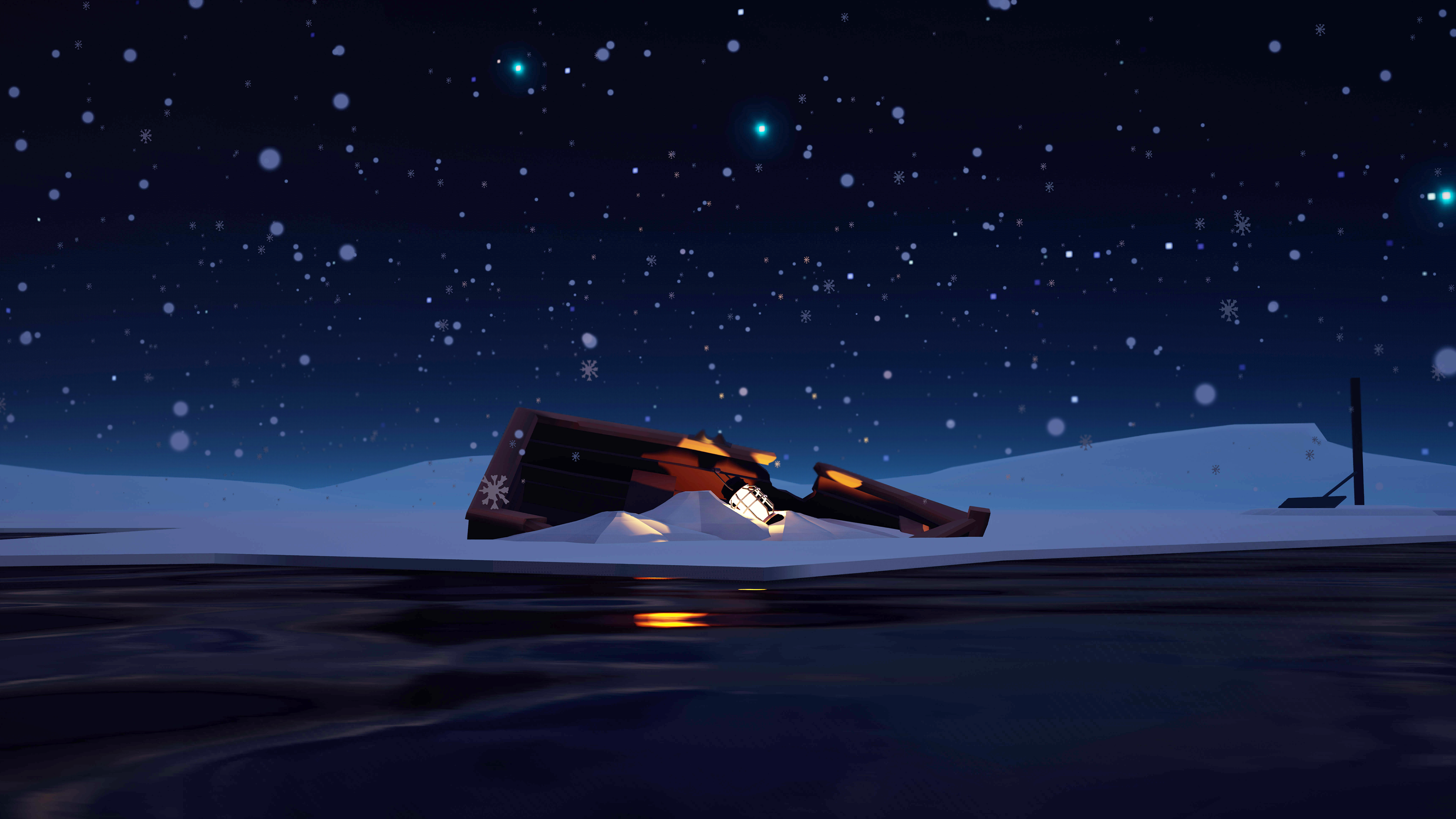
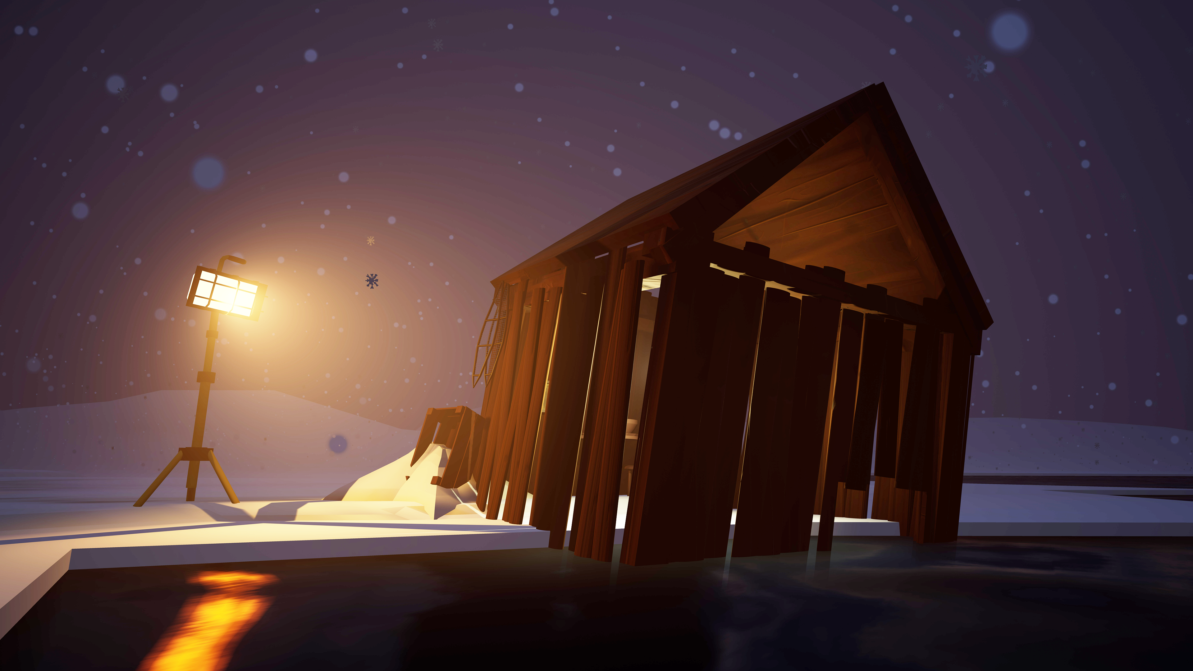
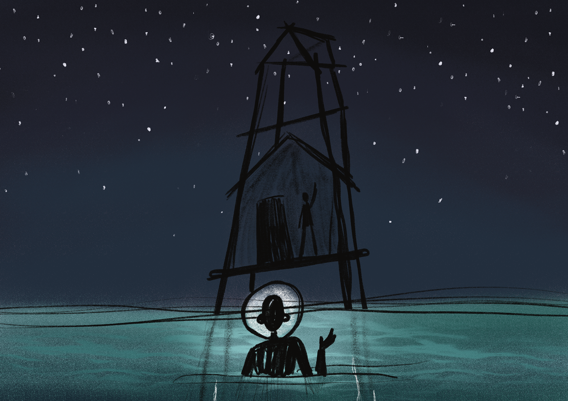
The first thing you see. an abandoned boat, covered in snow with a lonely lantern reflecting light in the water. This is meant to evoke a sense of wonder but also to foreshadow the tremendous loss the community within this world has had to go through.
Still there? has been selected for Kaboom animation festival (9-17 November 2019)and Go Short: International Short Film Festival Nijmegen.
In September 2019 it was screened 20 times as part of the Verkadefabriek's 15th anniversary event.
Coming November it will also be available to the public to stream online and on various game stores as a VR game.
Colour script
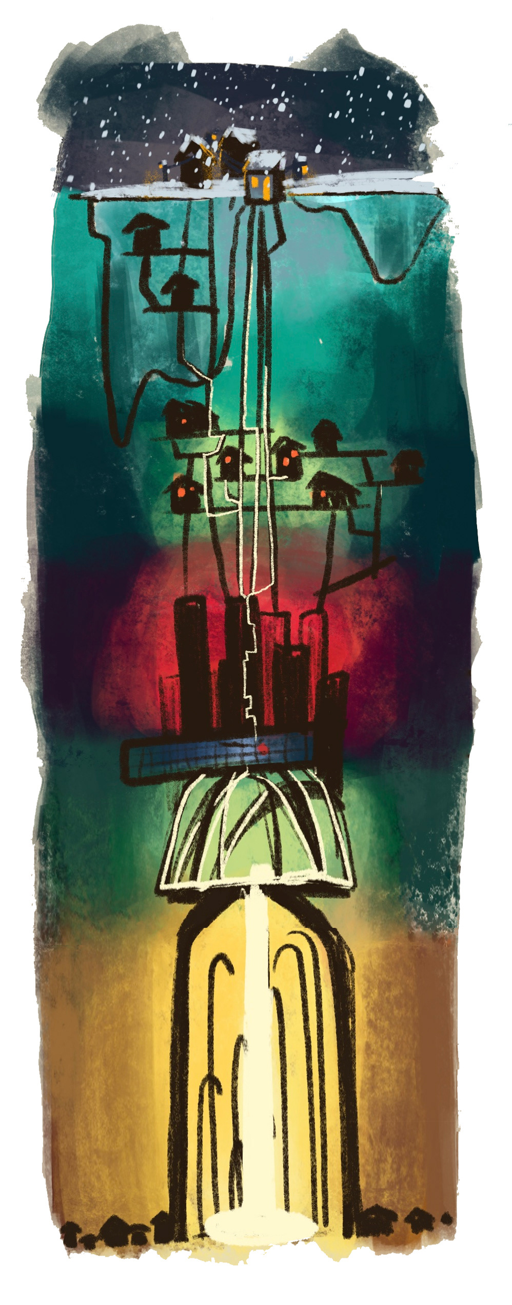
In the film, colour is used to strengthen the emotional impact of the moment as well as inform you of how this ancient society was doing when they built it.
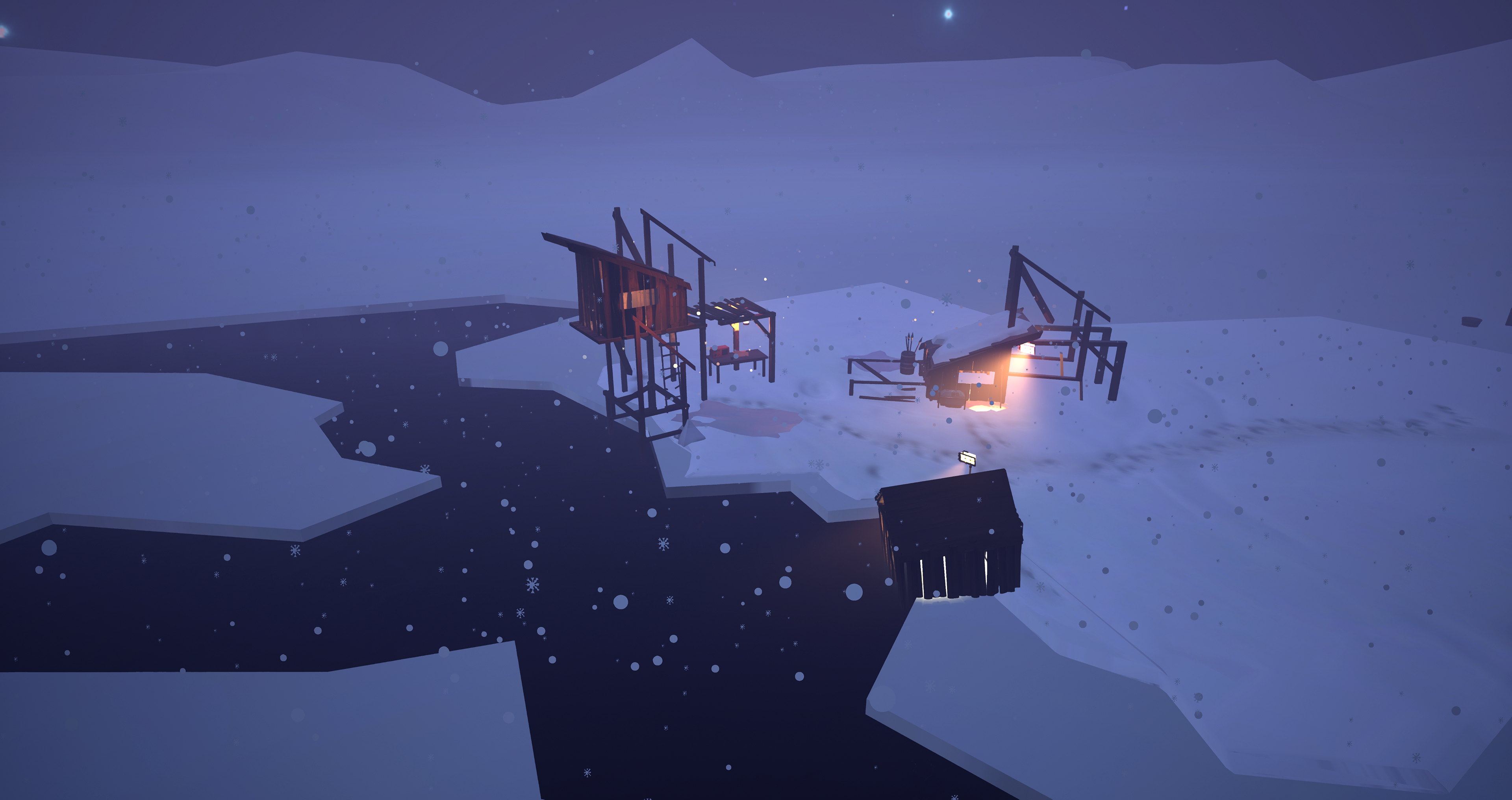
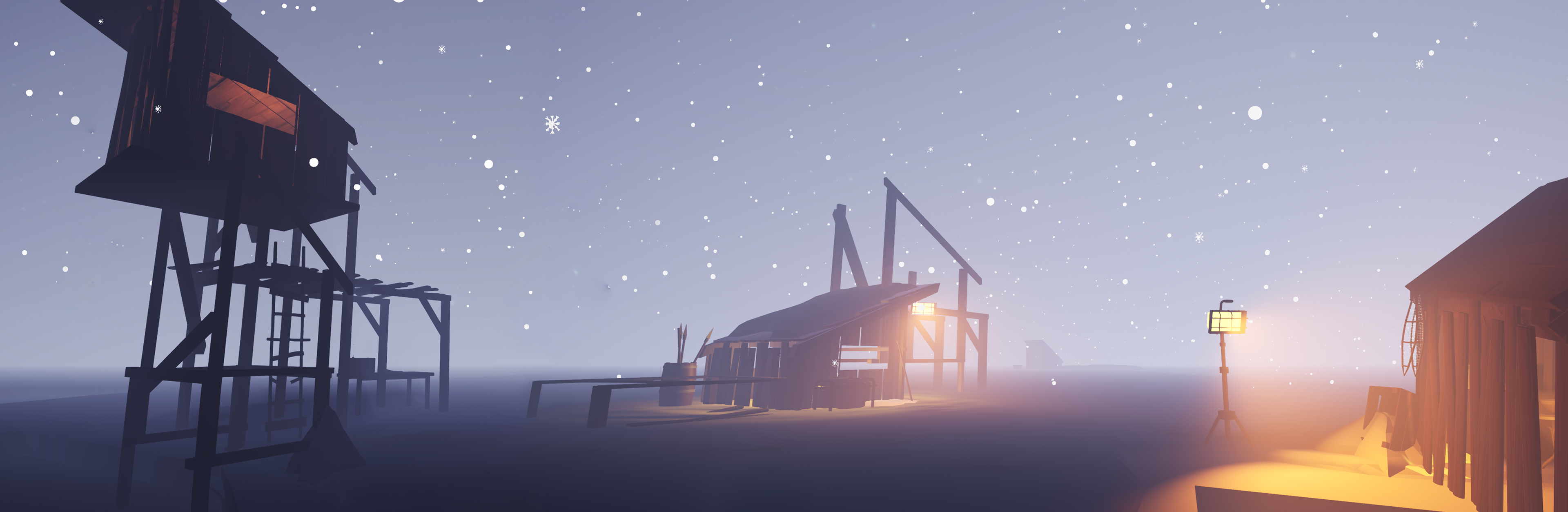
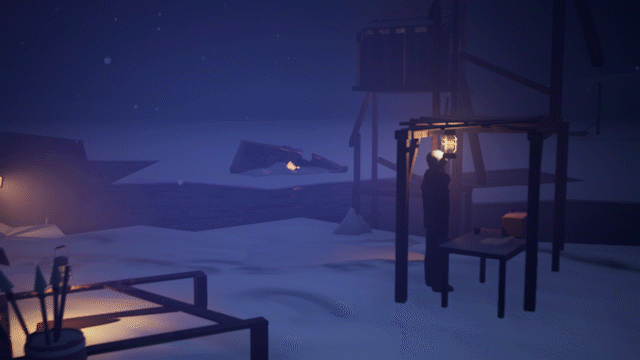
1. The shack
This is where you start. It's the first thing you see and you immediately notice conditions are dire. It's snowing and windy and the small houses that are built are poorly constructed, letting in most environmental hazards. To reflect this state the colours are dark, desaturated purple. The future doesn't look good and that's reflected with these desaturated colours.
2. Enforcements
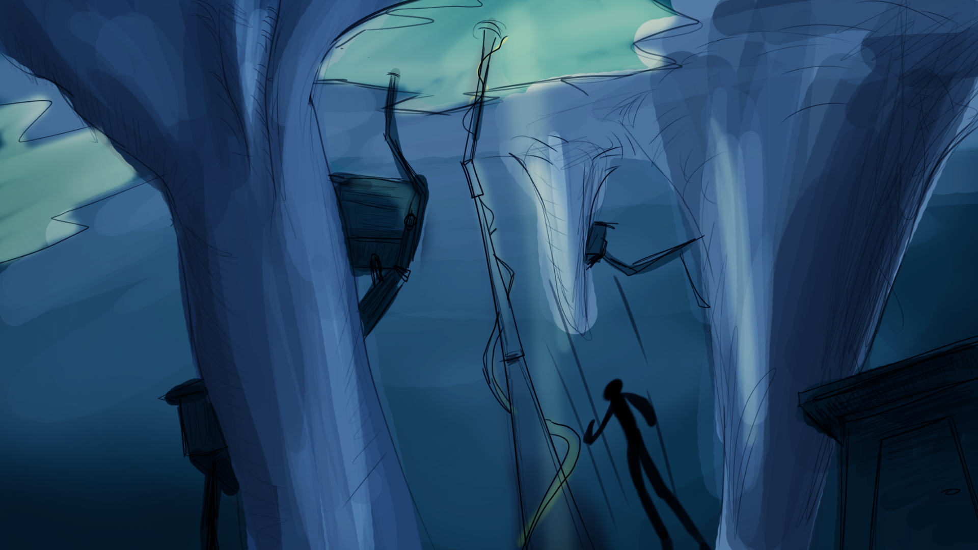
As you dive underwater there is little to see other than a few houses encased in ice and poles that the houses above water are built upon. The poles look unstable and overall the environment is desolate. The colours are aqua to communicate to the player tat they are underwater but are also dark to let you know how lonely it is down there.
3. Village
Further down you find the previous settlement of a generation before you, you can see signs of what once was life but has been abandoned due to the rising water. The shacks don't look great but there was a significantly larger number, indicating a larger community. The colours are a little bit warmer and greener to reflect this slightly more lively environment.
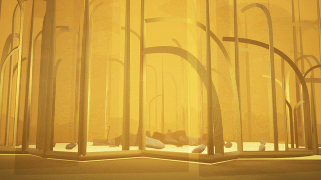
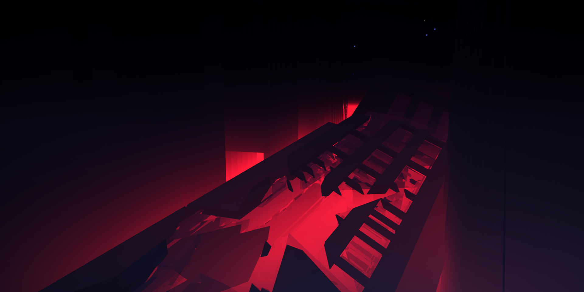
4. City
Suddenly out of the fog emerges this huge city full of skyscrapers. It is clear that some sort of conflict happened here after which the number of people shrunk so much that they only built the small amount of houses up above. You can see ruined skyscrapers and floating furniture indicating a better of society. The colours around you turn to a deep red. You feel conflict larger than yourself and the red is so intense compared to the previous colours that it's quite jarring.
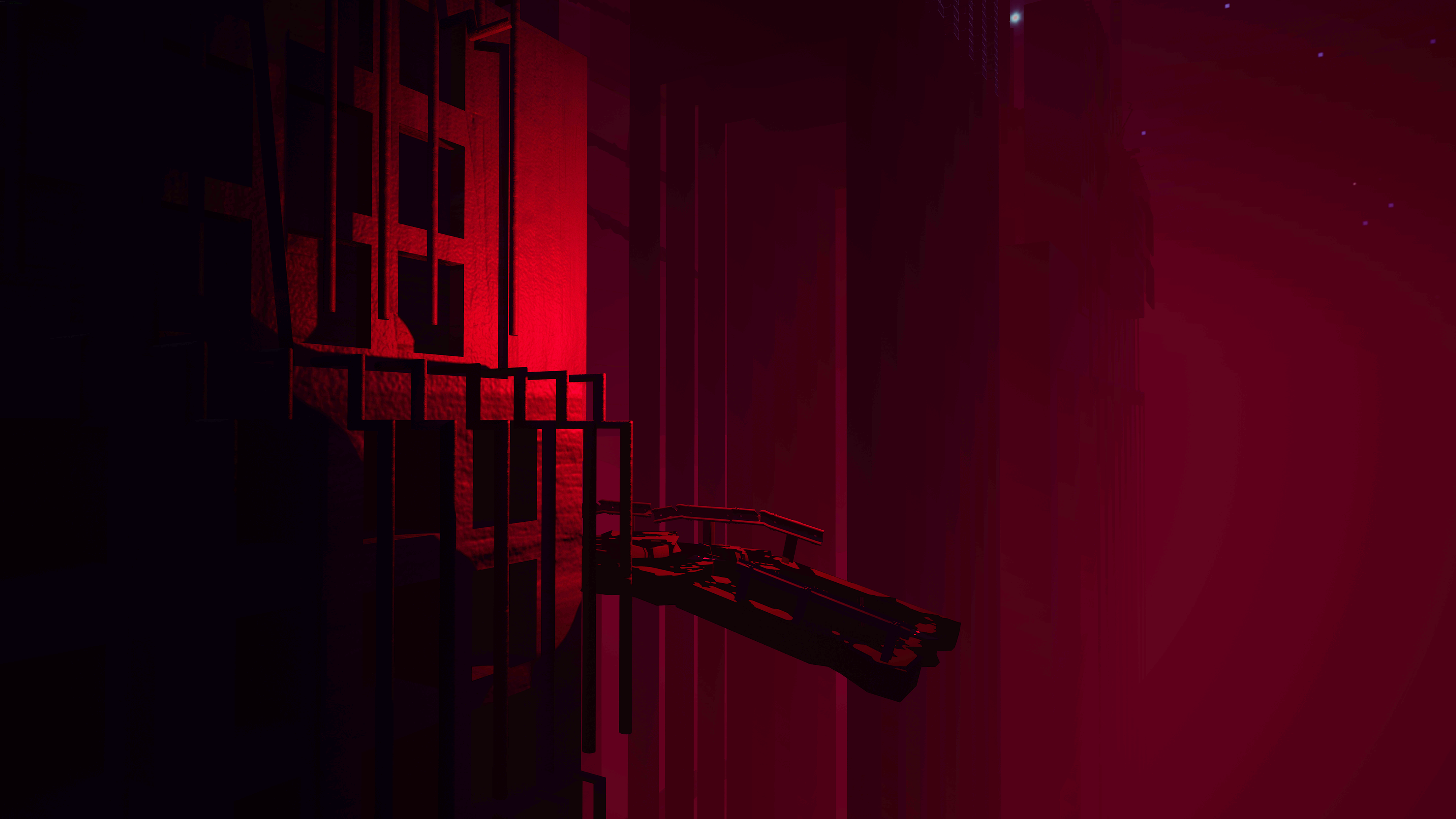
5. Skyscraper
After narrowly escaping the sea monster you get a moment of quiet, a moment of reflection. All seems lost. There is a phone though, blinking with a tiny red light. It starts playing an old voicemail from right before chaos erupted in the city, assuring you that there is still some hope.
The red light references the city you were just in, connecting the two together while the deep dark blue is there to mirror the sad and lonely tone of the scene.
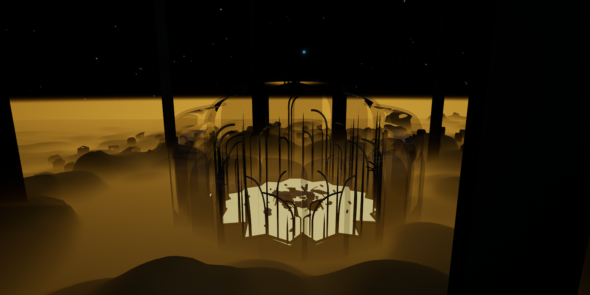
6. Utopia
Now that you're given some new hope you find a way down and find that there was actually something to the community's history that was nice and not so destructive. It was the height of the society, when all lived in harmony.
This is reflected in the colour script by warm, bright greens. The colour of healthy nature and a reference to the small village up above that was a darker, murkier green. It is meant to make you feel serene and indicate you're going the right way.
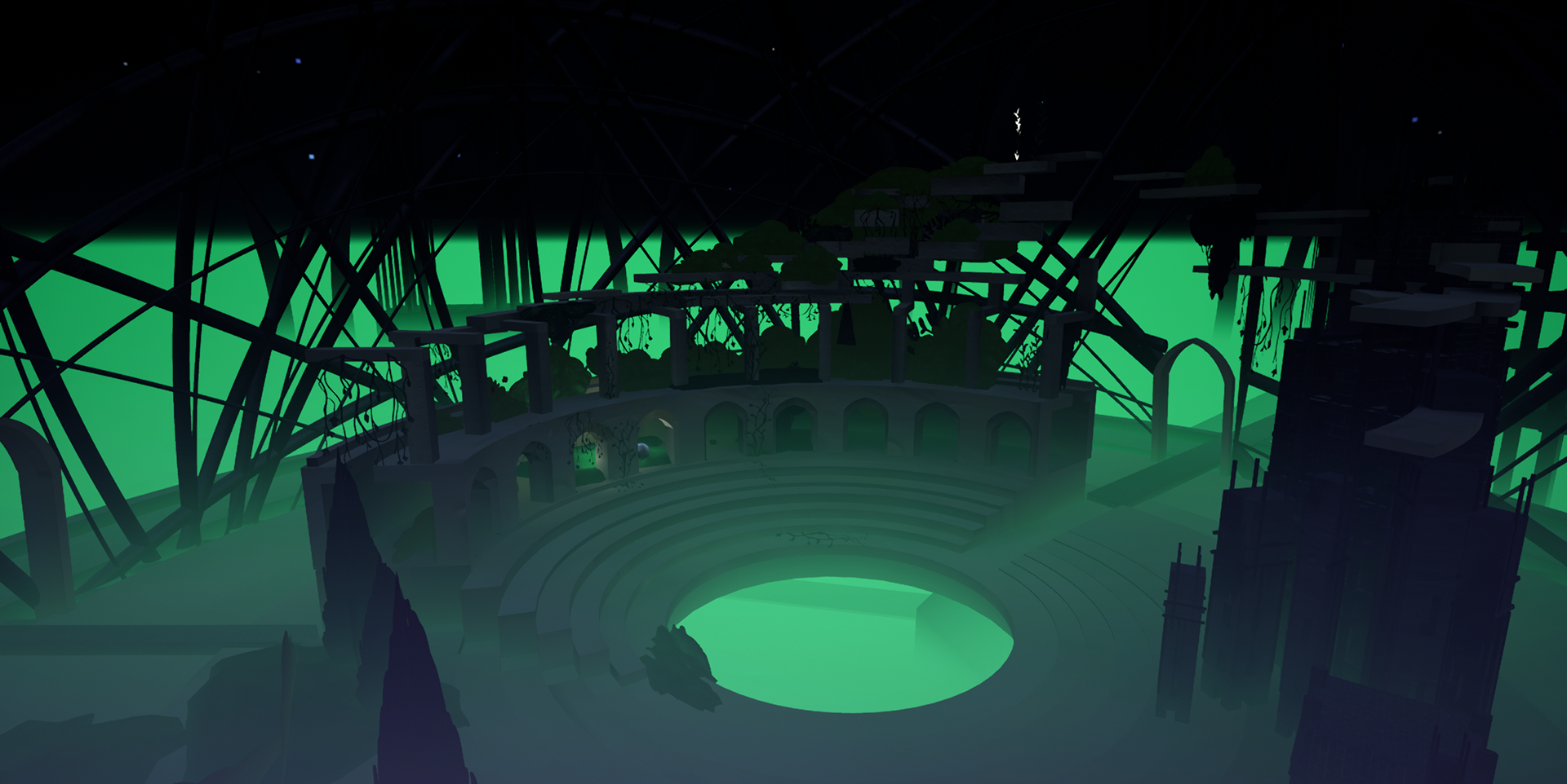
7. Temple
The last stage to the film and also where you discover what you were looking for. The civilisation, long ago, all shared a faith in the light which provided them with the ability to build upwards (which is how they build the utopia). They collectively built a temple for their light but after the huge conflict in the city rubble covered the temple, blocking the light. This is a direct parallel to the conflict causing people to lose their faith.
Yellow is used here as it is contrasted very differently from the rest but is also a colour related to positivity, warmth and religion/faith.
All of the slightly nicer stages in the film (the utopia and village) have colours with a yellow tint to them while the darker or sadder moments have cooler/bluer tints.
by Mischa Penders
by Mischa Penders
Character design
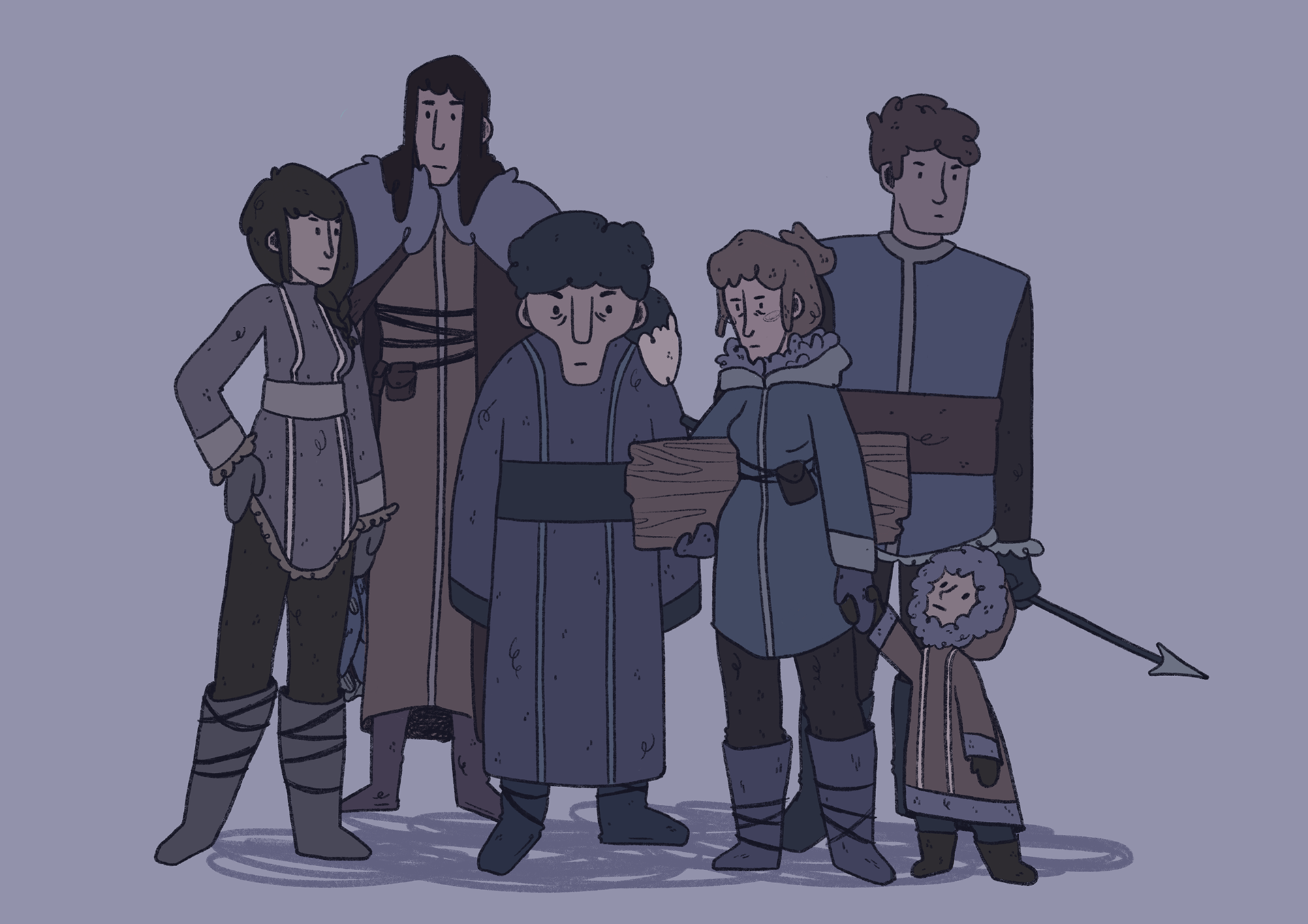
Even though eventually we had to cut the characters due to time constraints, characters were designed for the project by me. They would've inhabited and been moving around the small village above the water.
The current community have no idea what these lines represent, just that it's always been how they make clothing so since they can't afford to spend much time on what they wear, it stuck around.
They also wear clothing that works well within their environment. They live in a cold, snowy area that's highly foggy and open. In order to blend in with their environment (to avoid predators) they wear clothing close to the colours of their environment as well as the coats, boots, cloaks and other pieces of clothing being very warm to protect them from the snow and wind. I referenced Inuit clothing for these designs as they live in a similar environment here on earth.
Credits
Kela van der Deijl // director / animator / producer
Mischa Penders // director / animator
Liva Sadovska // director / spatial designer
Guus van der Putten // Voice acting 'radio operator'
Tijmen Raasveld // Voice acting 'sea monster'
Maya Bloem // Voice acting 'friend on phone'
For screening inquiries: kela@vanderdeijl.com